Building and scaling PCFinancial.ca’s design system
OVERVIEW
We aimed to create a scalable and accessible design system that streamlines developer handoff, provides CMS teams greater autonomy to produce marketing campaign pages, and improves user experience. I was responsible for leading the developer hand-off and strategizing the Figma design system library development for current use and future scaling.
April - May 2025
In testing
Product Designer (me!)
Product Designer
Product Design Co-op
Product Manager
2 Software Engineers
Product Designer
Product Design Co-op
Product Manager
2 Software Engineers
UX design, interaction design, visual design, motion design, illustrations, vibe coding :)
PROBLEM
The current design system is inconsistent
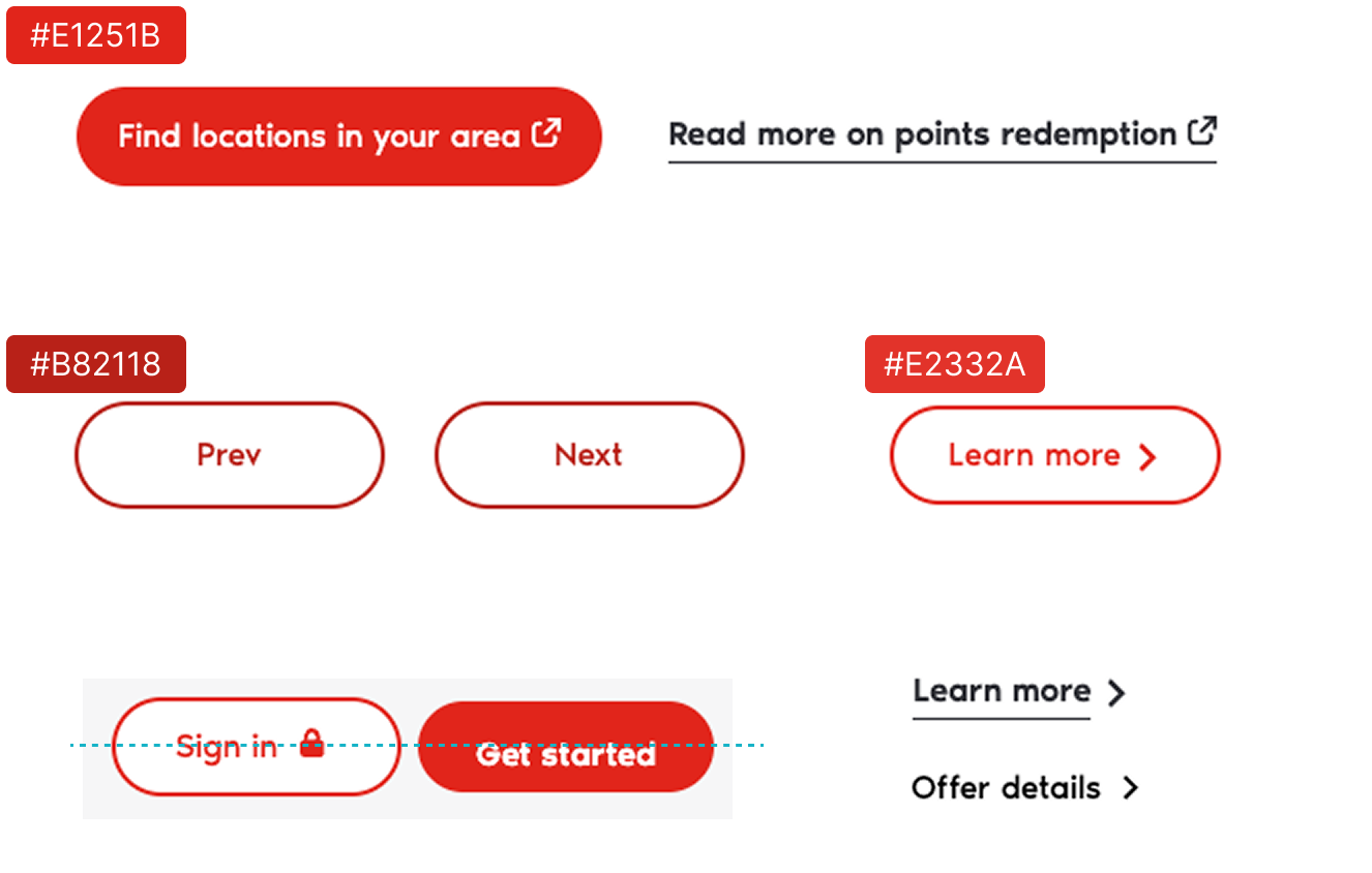
Just from a quick site audit, we could see that there are many inconsistencies found across the website. For example:
Different image and corner radius sizes

Button with similar, but different treatments
RESEARCH INSIGHTS
Improper documentations, lack of hand-off procedure, and ad-hoc design or dev changes
Design & Dev
Web experiences lacked consistency across desktop, tablet, and mobile due to frequent ad-hoc change requests/brand refresh, on top of the absence of proper component usage guideline and governance model. Developers faced friction due to unclear specs, while historically tight deadlines led to poor craftsmanship and recurring visual bugs in production.
Marketing & CMS
Ideally, marketing team and CMS content owners have full independence in creating campaign pages with no design and development support. However, the current design system is undocumented and poorly understood, leading to unplanned design and development work.
Findings
The current design system was not built with scalability in mind, resulting in inconsistency
HMW
How might we create a scalable design system that is reusable and easy for designers and non-designers to understand?
SOLUTION
A new design system library that functions as the source of truth for designers, marketers, and CMS content owners
Documentation as a Product
We need to treat docs like a living product: clear, visual, easy-to-use, and most importantly, iterative. We also bake in WCAG/AODA compliance from the start.
We need to treat docs like a living product: clear, visual, easy-to-use, and most importantly, iterative. We also bake in WCAG/AODA compliance from the start.
Consistency with
flexibility
We want to standardize patterns and components to create cohesive experiences. Allowing for flexibility so teams can adapt to new contexts without reinventing is also crucial.
flexibility
We want to standardize patterns and components to create cohesive experiences. Allowing for flexibility so teams can adapt to new contexts without reinventing is also crucial.
Developer-First Implementation
We should prioritize handoff clarity, naming conventions, and technical feasibility. Documentation needs to be written for actual builders, not just designers.
We should prioritize handoff clarity, naming conventions, and technical feasibility. Documentation needs to be written for actual builders, not just designers.
Approach
Designing in three phases to support three types of users
This design system is used by a small team of designers and non-designers in an evolving bank that actively releases new products and features. It is crucial that the system support both needs.

Phase 1: Clean up and minimize components
Since we have some pages that are already designed, we ran an audit to minimize the numbers of components used.
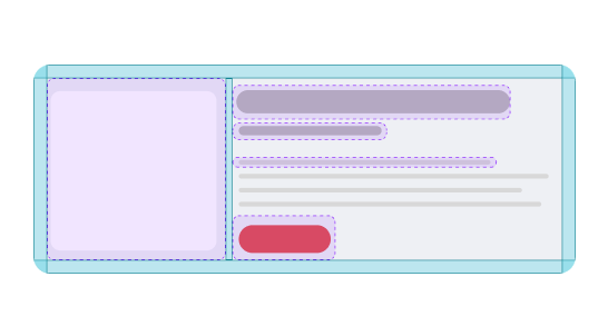
Phase 2: From monoliths to modules
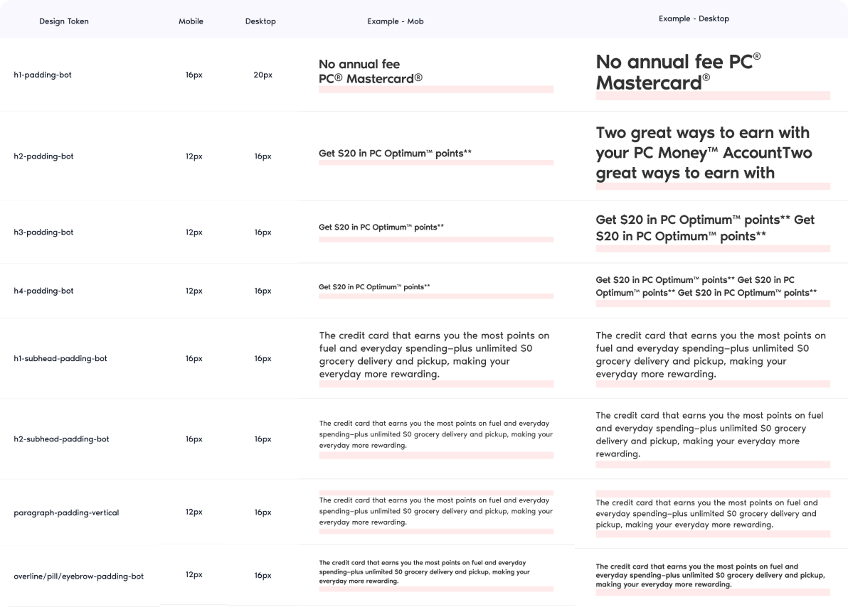
We break down the components into properly named and tokenized colors, typography, and grid/spacing values to Figma and codes are in sync.

Phase 3: Monolithic but modular library
Our designers or CMS content owners need a clear, simple-looking library for future page designs. So, the last step of the design system is building it back into ready-to-use components or content block.
challenges
The design system initiative's timeline is parallel with the website redesign initiative done by an external agency
Late in-house design involvement
External agency work on page designs, but design system work is not in scope, leaving gaps for the internal team to solve.
Overlapping timelines
Campaign pages are still happening in midst of the website redesign initiative, and the newly built components often affect production.
Severe resource constraints
Only two frontend developers were available to implement all system components. At some point of time, we only had one front-end dev working on the components (thank you Nithesh!)
No existing design system template or governance model
Since design system was never properly built, we need to create a uniform design system template that reflect UX, content, product, and engineering considerations.
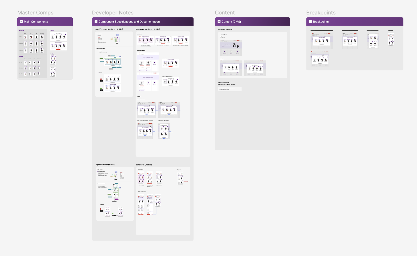
THE NEW DESIGN SYSTEM
Refreshed to empower designers, developers, marketers, and content owners
BEFORE
Devs, marketers, CMS, and designers are only given the master component and breakpoints. Important information such as CMS toggleable content, token sheets, and interaction/behavior are missing.

✪ AFTER
Collaborating with product manager and software engineers, we created a template that consists of all the important information needed by all types of users: master component, developer notes, CMS considerations, and breakpoint views.
BEFORE
Components are not built with modules, causing inconsistencies as the team scale.
✪ AFTER
Components are built around toggleable modules to support various content, allowing for multifunctional uses. This also mimics CMS configurations.


BEFORE
Tokens are built for design use only
✪ AFTER
Tokens are named consistently across code, CMS, and Figma
OUTCOME
The immediate results
Since the project is ongoing, we are yet to see long-term results yet. However, there were instantaneous results:
Smoother hand-off, QA, and implementation
By streamlining handoff and documentation, we reduced back-and-forth with developers, cut QA bugs significantly, made visual and accessibility issues easier to track, and accelerated QA approvals
Faster design process when adding new components
The new system freed up time previously lost to rework, allowing us to introduce higher-quality visuals and microinteractions while maintaining consistency that historically wasn’t achievable.
Introduced the use of AI tools like v0, Figma Make, and Cursor
We had limited time to iron out the microinteraction details, so I picked up v0 and Figma Make to communicate interaction design and responsiveness needs to my devs. We loved how fast and clear design x dev collaboration was with this approach.
NEXt STEPS
What's (planned) next?
Define governance model and adoption tracking
In the future, we want to define a governance and adoption model. Governance makes sure new components are added consistently, and adoption tracking shows how widely the system is being used. Both are key to keeping the system reliable and scalable over time.
Test with marketers and CMS content owners
1/3 of the new components are currently being developed, so we had not gotten the chance to test it. If I had the opportunity, I would love to have a low-stake pilot project (eg. SEO page) made entirely by marketers/CMS content owners with no design involvement.
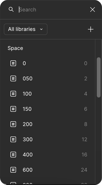
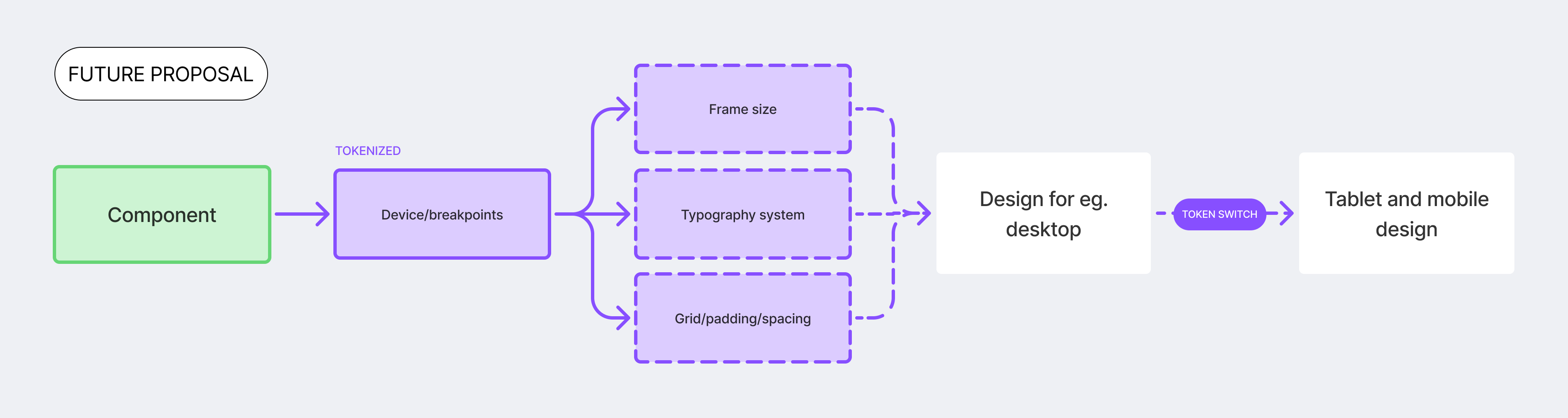
Device/breakpoints tokens
Currently, designers spend their time designing for three platforms: mobile, desktop, and tablet (or on the banking app side, iOS, Android, and desktop). In the future, I'd like to embed device tokens so design workflow is further optimized. It will more or less look this: